Quyền Vũ
Director
| Client | Ho Chi Minh City Children’s Hospital |
| Industry | Medical |
| Location | Ho Chi Minh City, Vietnam |
| Year | 2017 |
| Scope of Works | Brand Strategy Consultant / Brand Identity System Design |
Not the latest project, not even the project with the most significant commercial value, but City Children’s Hospital is a project that left the most profound impression on the Vu Digital team for many years.
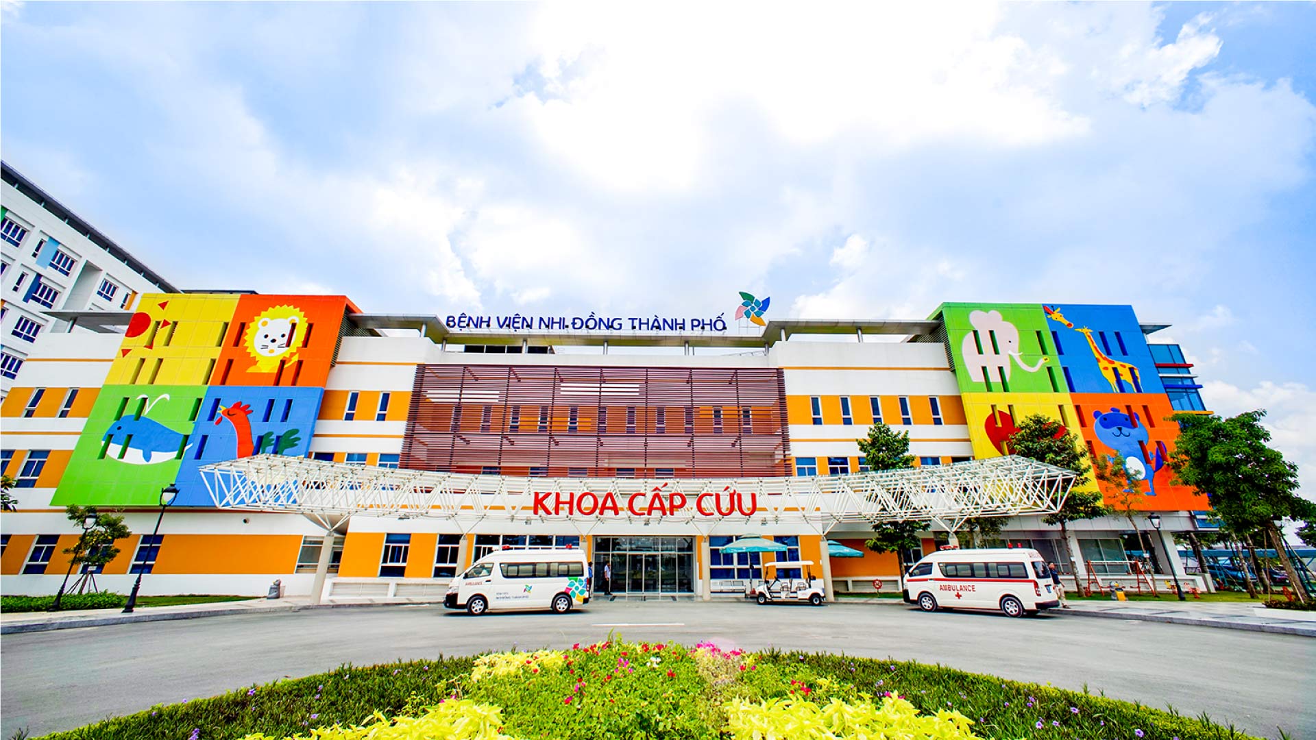
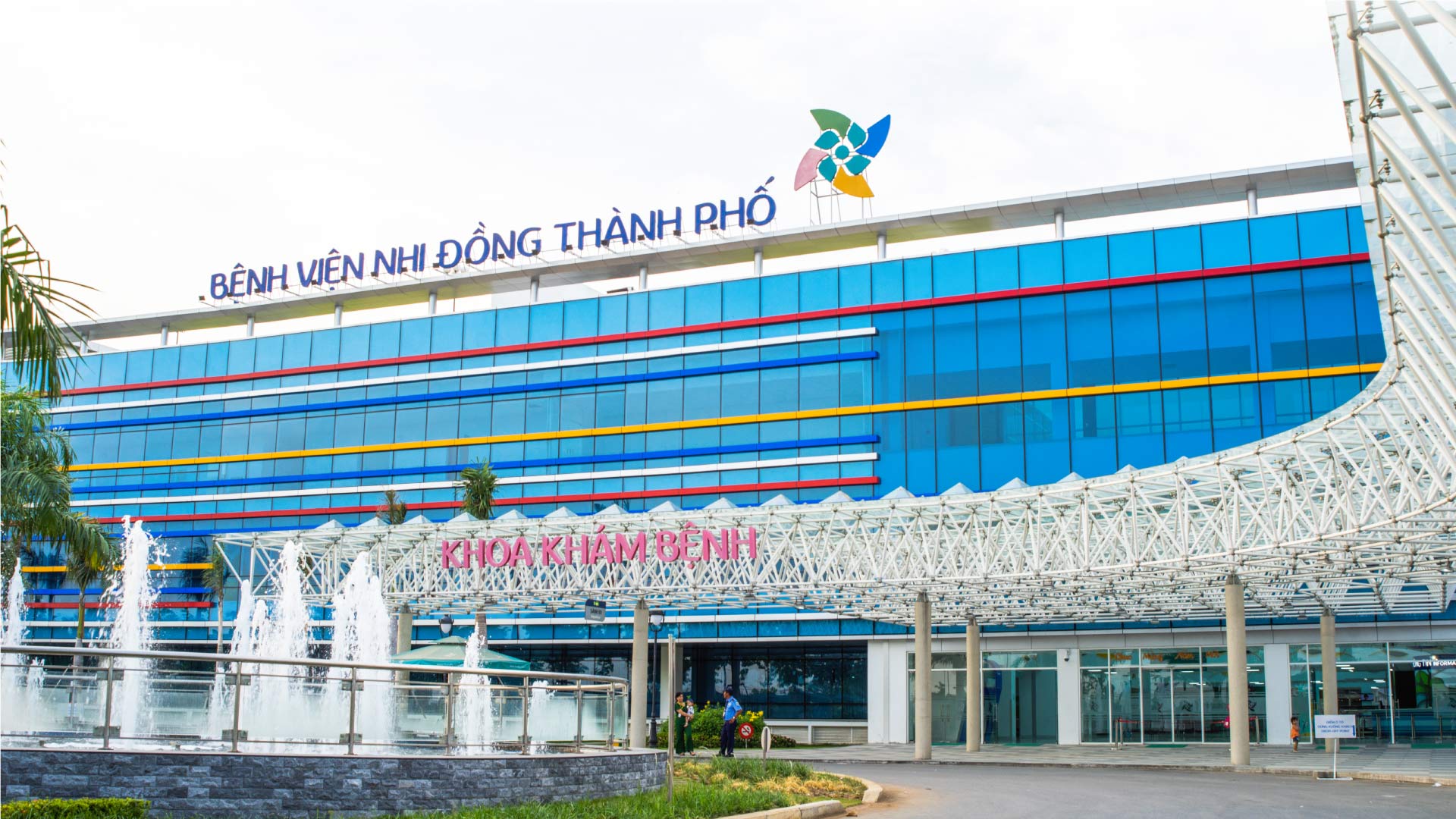
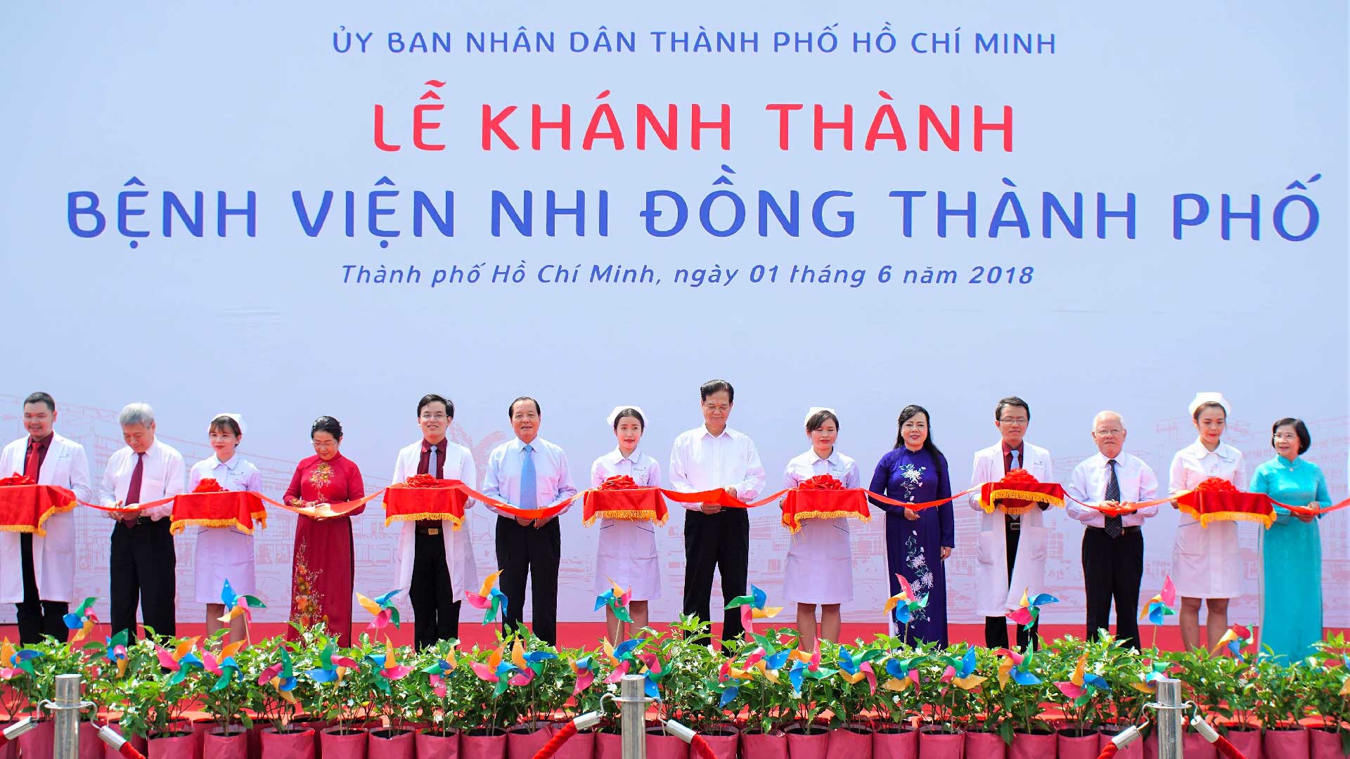
At the end of 2014, with an investment of about VND 6000 billion, City Children’s Hospital was founded in June 2018 with a floor size of 12,000 square meters, an eight-story basement, and more than 1,000 beds.
With a previous partnership through the image design contest of Children’s Hospital 2, Dr. Truong Quang Dinh, now the Director of City Children’s Hospital, contacted Vu’s team for a new project. He asked us to design City Children’s Hospital’s identity system and brand image. The goal is to make the Hospital the most modern place for children’s medical examination and treatment in Southeast Asia.
Change the brand name Children’s Hospital
Initially, the brand name proposed was “Ho Chi Minh City Children’s Hospital.” It is a bold idea when it is entirely upstream compared to “Children’s Hospital 1” and “Children’s Hospital 2.” However, Vu’s team also noticed two problems with this name.
First: the hospital brand name must be short and meaningful, and it also has to show the brand’s stature. “Ho Chi Minh City Children’s Hospital” goes against that criterion, and it is a relatively long name that can confuse audiences.
Second: the target group of patients and patient’s families that the brand targets are Vietnamese Southwest. The name “Ho Chi Minh City” is entirely out of their perception, and instead, they call it “Saigon” or simply “City.” Referring to the phrase “City,” people in the Southwest implicitly understand that it is Saigon or Ho Chi Minh City.
Ultimately, Vu removed and renamed it the City Children’s Hospital. Luckily, we have the consent and support of the Hospital’s leadership.
Refresh all fonts
Whether by coincidence or some prior calculation, most hospital brands across the country use the same Times New Roman font set – an old and outdated choice.
Brand names appear with a specific formula, only the words printed on the Hospital’s name without any other symbols. It is an obsession for those who have to go through that door.
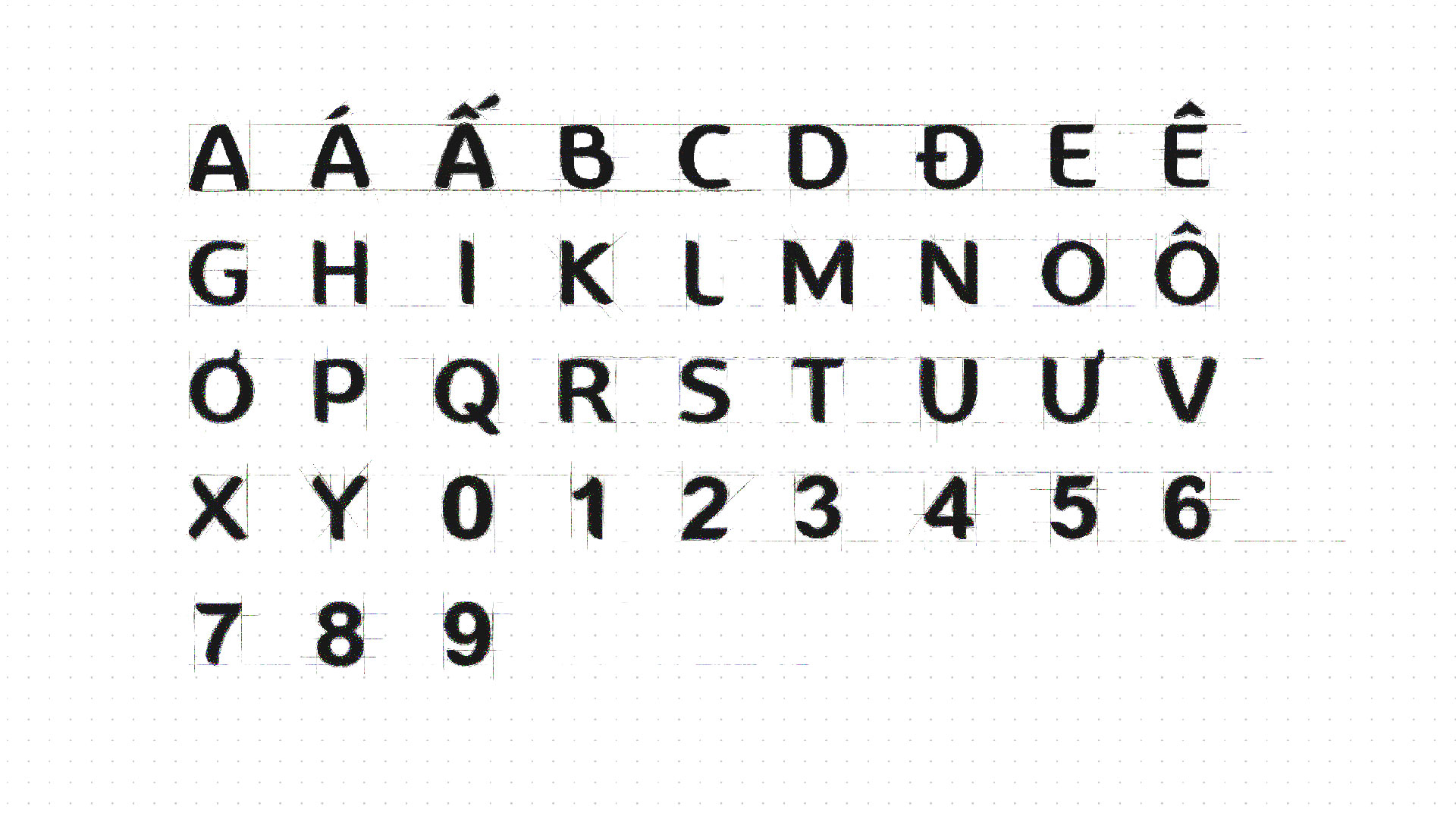
Therefore, Vu decided to refresh the entire font and put on the City Children’s Hospital brand a new soul for the visual language. We design a new set of exclusive fonts that can only appear with the brand.
The typeface follows the modern sans serif design language, but it’s not too rigid and square like the way Sans Serif has shown. Instead, Vu added curved lines at the corners to the font design, creating a soft, easy-to-read visual effect and partly expressing the identity of a children’s hospital brand.
The new font is a makeover, and almost immediately, it received the support of the entire board of directors and staff, doctors, and nurses at City Children’s Hospital. They put it into use immediately after and bring positive effects, proving that Vu’s bold decision to change is correct.
Choose the icon associated with the logo design
The most challenging thing was how to completely change the mindset and orientation of the leadership team, the doctors, and the nurses of the City Children’s Hospital at that time. From the vision of becoming a comfortable, modern hospital by putting all its efforts into technology or medical equipment, Vu wants City Children’s Hospital to become a close, friendly, and uncluttered destination for the patient and their family.
A hospital brand logo is a real battle between many different options. The requirements for the logo design are: highly identifiable and innovative but still bring a sense of closeness and friendliness to the children and parents.
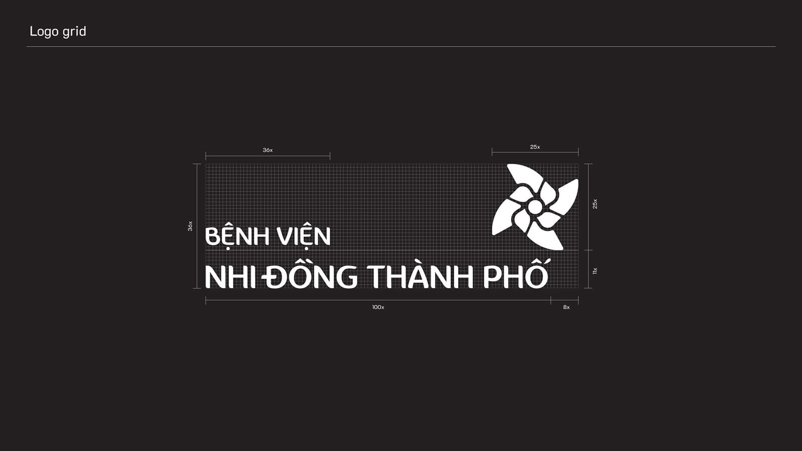
Ignoring many concepts such as flying birds, children running and playing or kites fluttering in the wind, we chose the image of the Pinwheel Wing to become the central concept for the overall identity design.
But why? Firstly, the pinwheel is a toy in the childhood memories of many of us, even for the little ones born in the modern era with many high-end entertainment facilities. It is always a bold image in the memory and subconscious of every child.
Second, Vu’s team aims to bring a concept that symbolizes strength and non-stop movement and represents the excellent health of pediatric patients. It is also why, besides the pinwheel image, there are other moving symbols such as children playing, birds flying or kites fluttering in the wind.
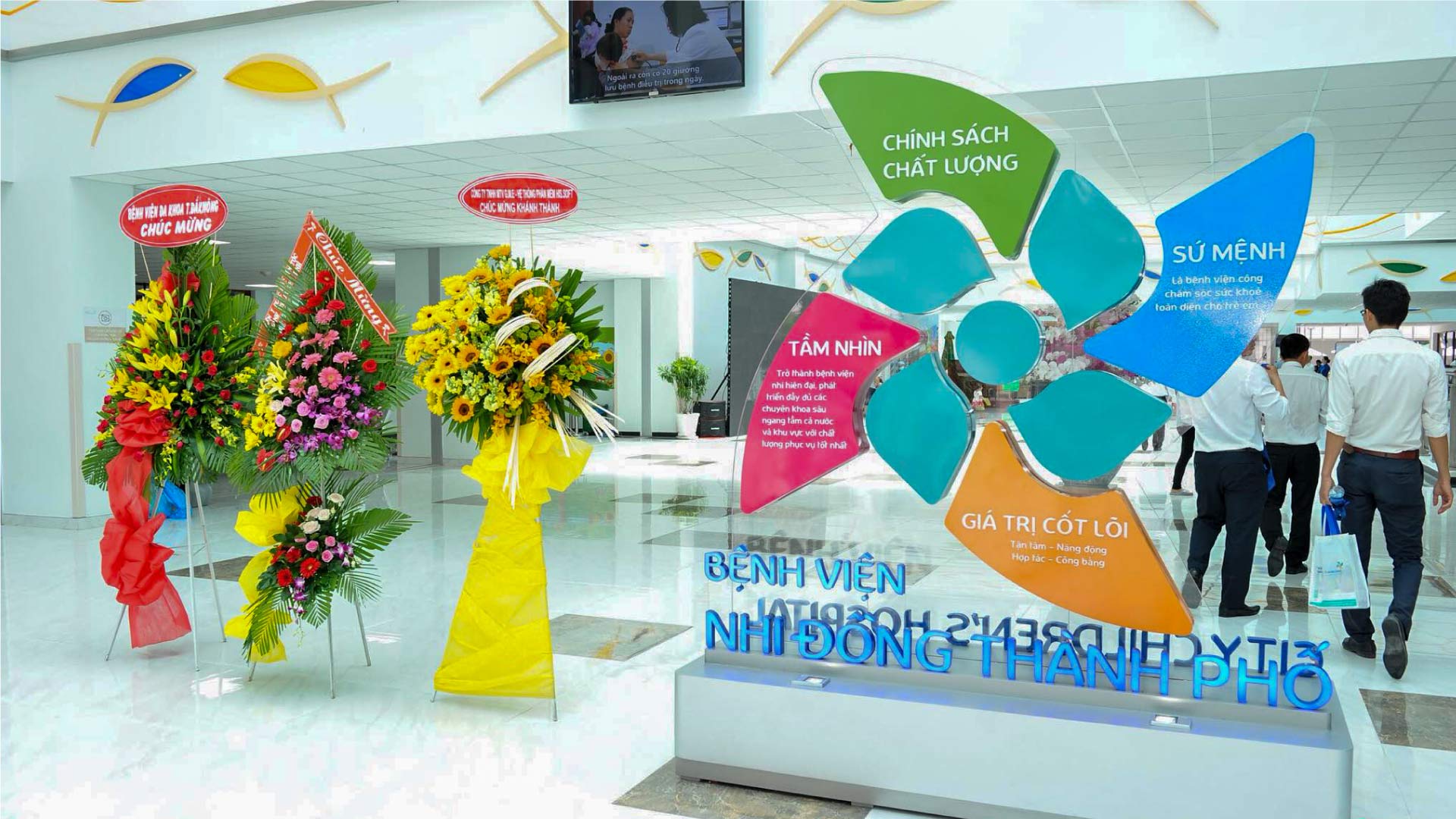
Later, the pinwheel icon was also included in the official website design with motion effects, creating a feeling of friendliness, comfort, and motivation for children to win against disease.
Based on the understanding of behavioral psychology, Vu wants to navigate people with the pinwheel symbol to make a difference with Children’s Hospital 1 and Children’s 2, based on each person’s unique history. We attached the City Children’s Hospital image to the pinwheel to achieve the name “pinwheel hospital,” which is easy to distinguish and identify.
Furthermore, the medical team also boldly used the image of pinwheels to decorate every smallest detail at the Hospital. It helps the City Children’s Hospital brand have another lovely “nickname” – Chong Chong Hospital.

