Quyền Vũ
Director
| Client | UAN |
| Industry | Marketing & Communication |
| Location | Ho Chi Minh City, Vietnam |
| Year | 2020 |
| Scope of Works | Brand Strategy Consultant / Brand Identity Design |
Consulting, design, and rebranding project for UAN
UAN – Unlock to connect
Mr. Tu Bui – Founder of UAN, once shared that UAN was in the process of transforming its strategic orientation and aiming for value creation through connection. Its community is evolving from merely connecting members of the community to connecting many communities because one person, one member, has different desires and values, which exist in various communities. More communities that grow together will create more value, which UAN believes and aims for.
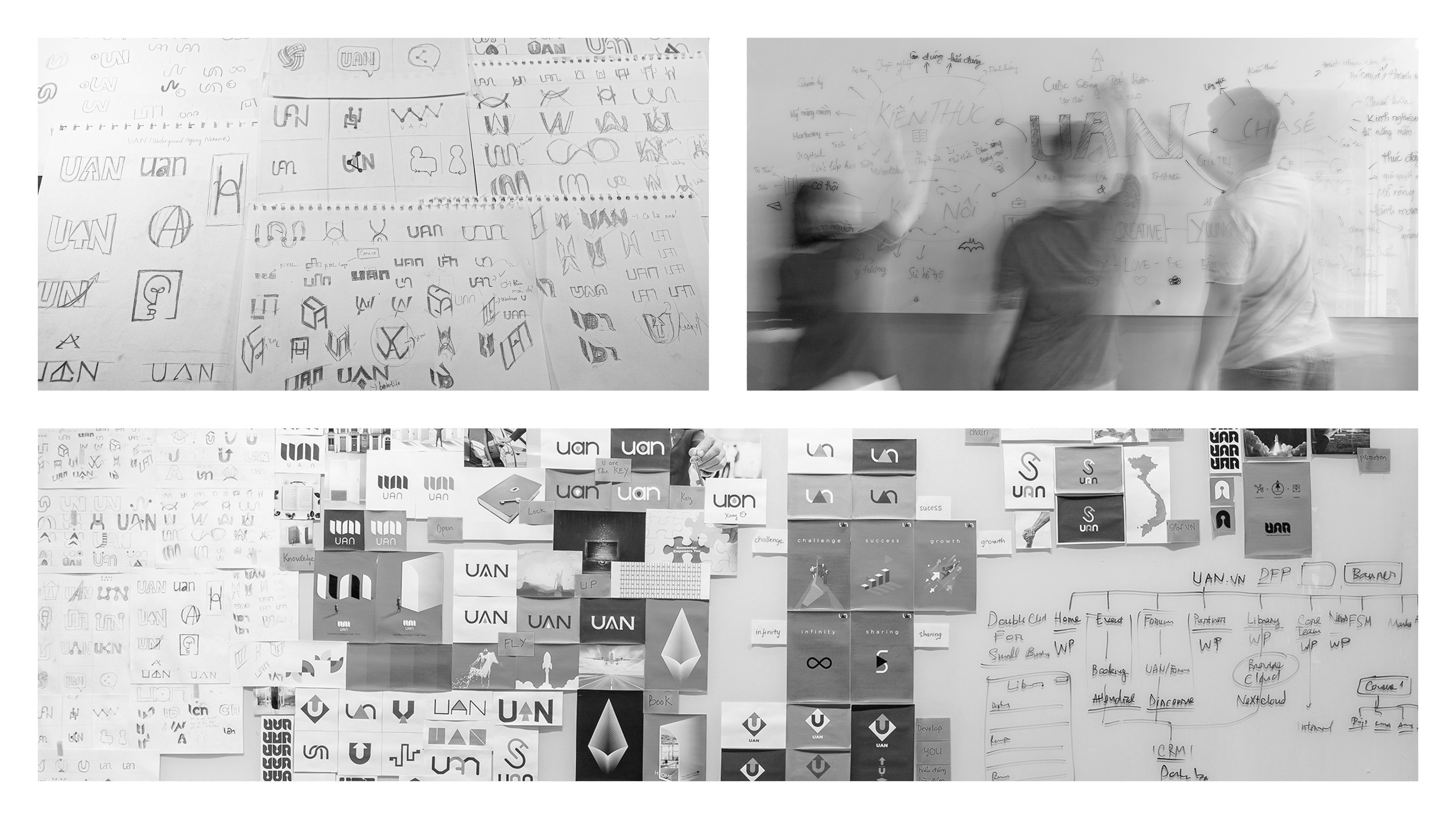
The brand keywords the UAN team listed are connection, new opportunities, growth, and community. Vu Digital then, in the logo presentation, gave a few options and suggestions with concepts:
1. The Door (opens up opportunities)
2. Rocket (growth or discovery)
3. The Key (unlock – open opportunity)
Finally, UAN chose and used The Key concepts because:
- Unlocking represents the opening of something that will show us opportunities and possibilities we have not seen before. Unlocking also symbolizes solving a problem by opening doors, connecting, and finding new things – which is what the upcoming UAN wants to do.
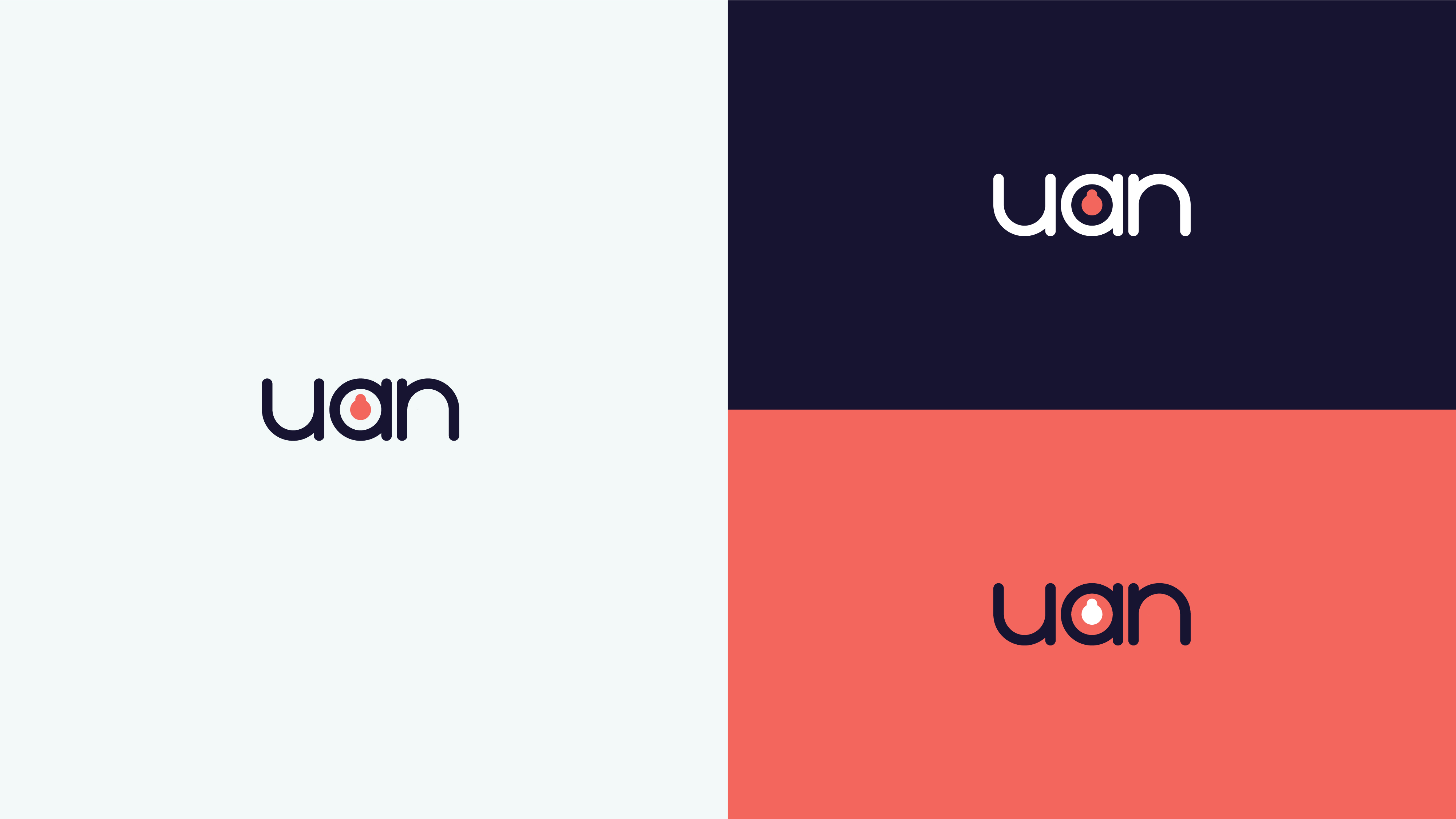
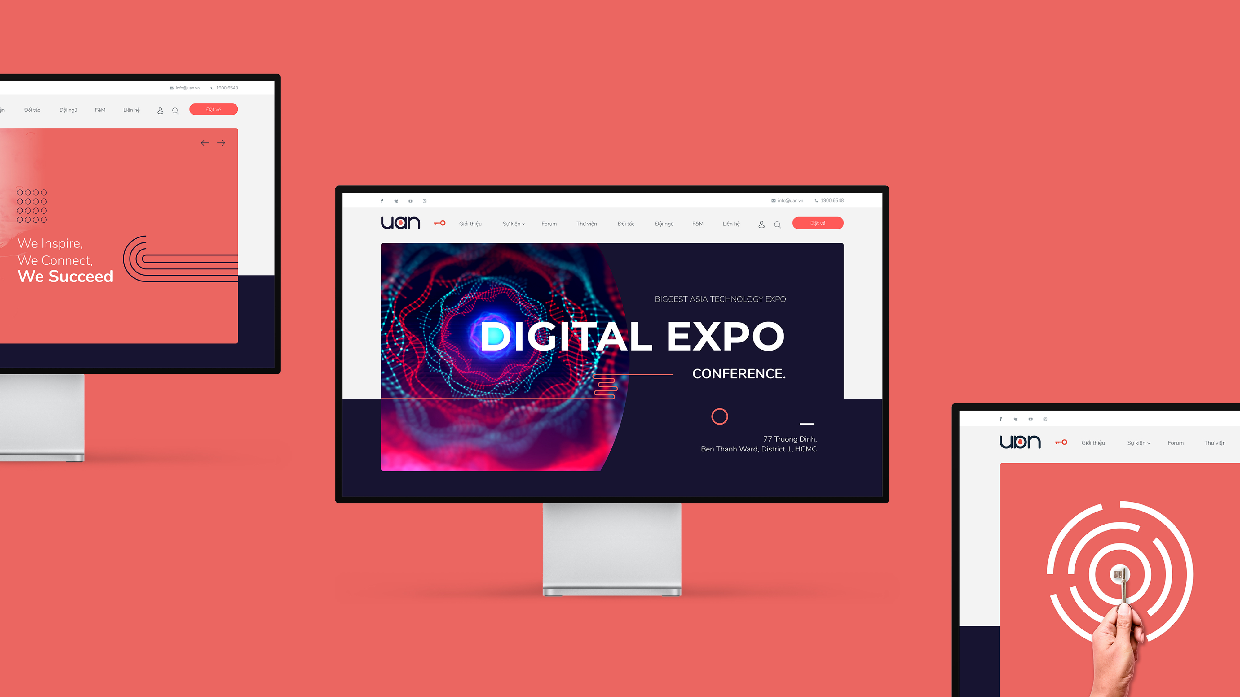
- Unlocking involves twisting and turning the key – the symbol in the center of the logos. “A” letter is a keyhole signifying that connecting to the UAN opens up new possibilities and opportunities.
- The logo of UAN stylized with the letter U and the letter N can change positions for each other when rotated 180 degrees but still retains the logo.
- The logo image from a tough square angle instead of a soft round stroke represents flexibility in the upcoming development direction.
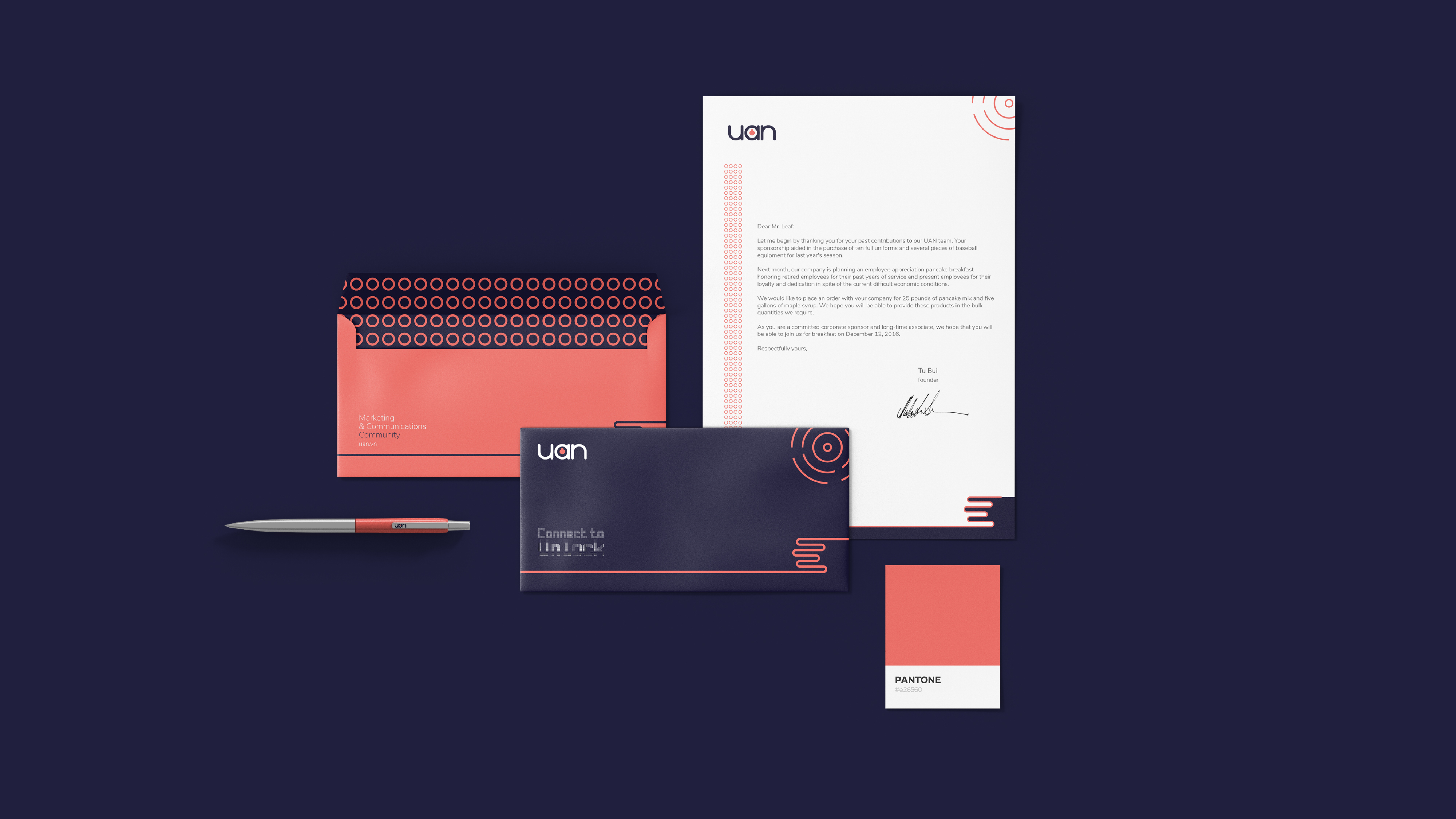
UAN’s new logo also comes with other brand identity changes such as color (basic black and red are replaced by dark blue and red-orange, looking more modern and pleasing to the eye). There is an animated version of the logo presentation with sound, new brand guidelines, new tagline (“Unlock to Connect” replaces “Digital or Die”).
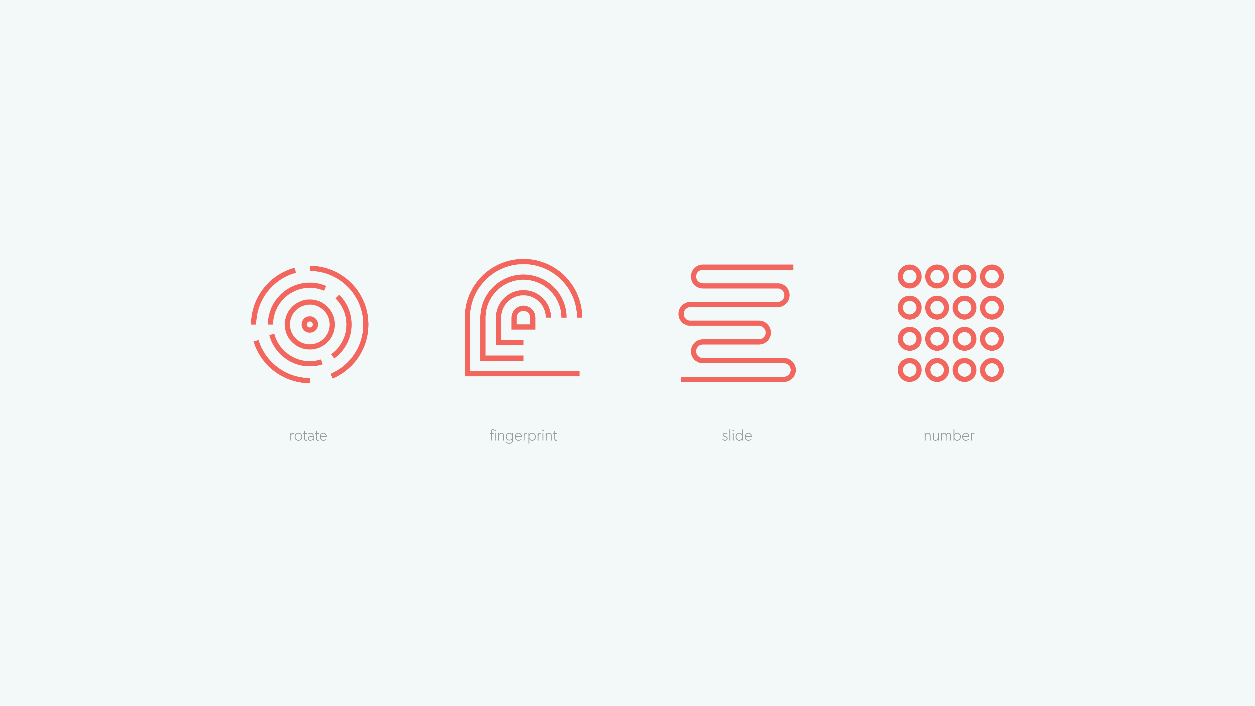
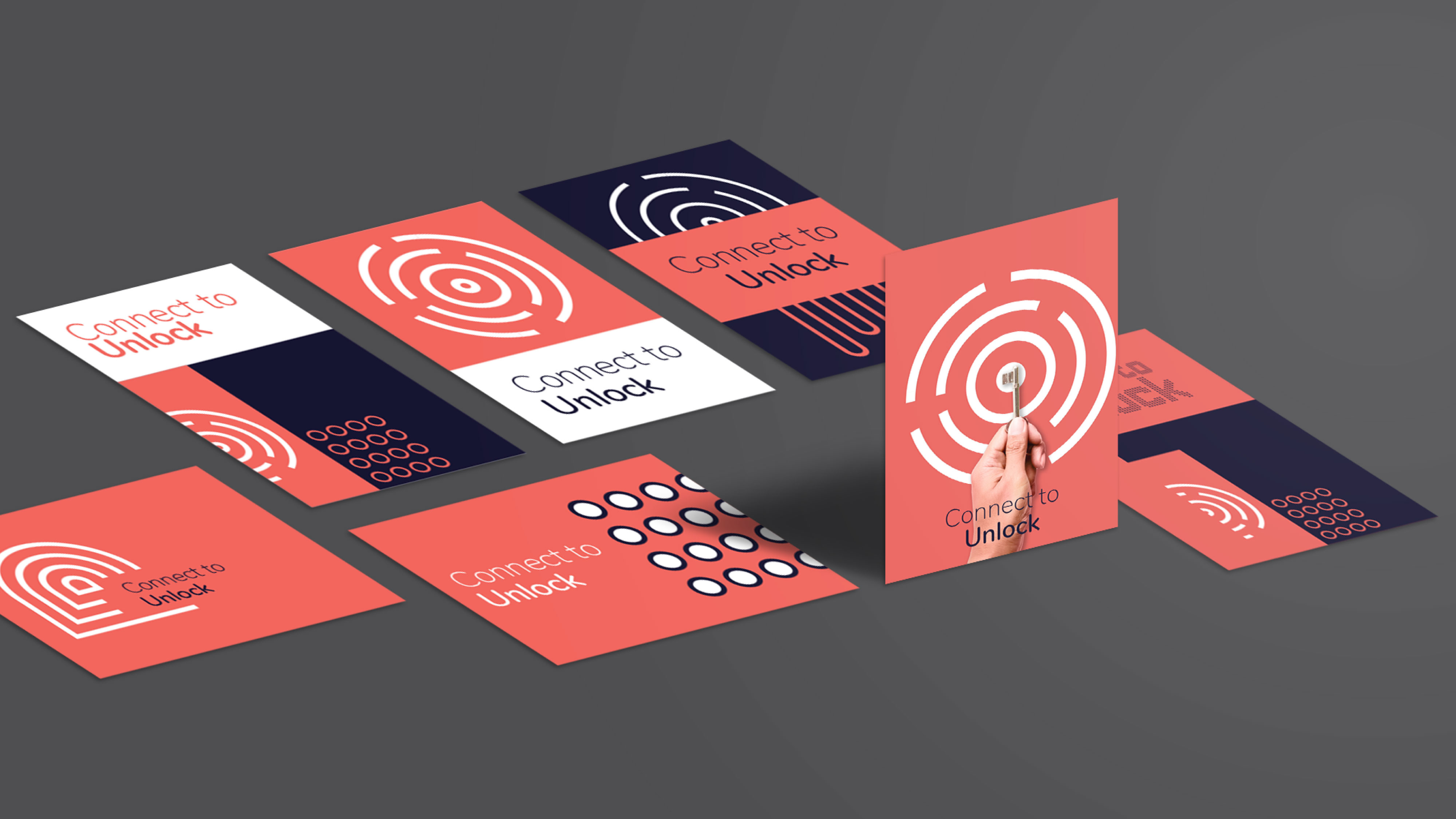
Vu continues to create four supporting patterns for unlocking, further expressing the message that UAN wants to convey, including:
1. Rotate
2. Fingerprint
3. Slide
4. Password
The tagline also changes and is flexible according to the logo. It can also be “Unlock to Connect” or “Connect to Unlock.”
In 2020, UAN officially changed and put on a new identity. Replacing a logo that has been around for many years is a big decision. This brand identity transformation marks a significant milestone and shift of the UAN community to continue pursuing substantial and meaningful value.
We are happy and proud to have a chance to work with pure and professional people. Only then will we create products & values beyond expectations.
Initially, we only intended to design the logo, but the result is a new, more professional, and sustainable brand positioning.
Special thanks to Mr. Tu Bui, the UAN team, and the Vu Digital creative team.

